The Role of Color in Emotional Expression of Artworks
Understanding Color’s Impact on Emotional Resonance
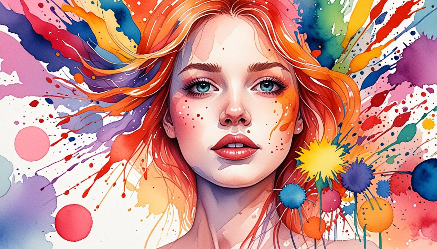
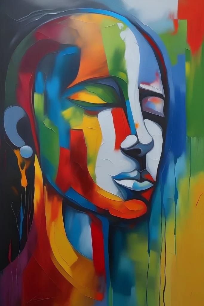
Colors are more than just visual elements; they are powerful tools for emotion and storytelling in art. Artists have long understood that different colors evoke various feelings and associations, influencing how viewers perceive their work. For instance, the color red often signifies passion and energy, while blue can evoke a sense of calm or melancholy. This is not just anecdotal; studies show specific colors can prompt predictable psychological responses.
While engaging in hobbies such as painting or photography, enthusiasts often experiment with color palettes to express their own emotions. Recognizing the psychological effects of colors can enhance their artwork and resonate more deeply with their audience. This deepens the connection between the artist and the viewer, as these colors can evoke shared experiences and emotions.
The Emotional Significance of Colors
This article will explore the top five colors in art, revealing their emotional significance and how they can transform a piece into a profound statement. Let’s consider some examples: yellow, often associated with joy and energy; green, representing growth and harmony; purple, linked to royalty and mystery. By strategically employing these hues, artists can convey complex narratives and themes.
Prepare to discover how color choices can define not just the aesthetics of an artwork, but also its emotional impact. Whether it is a fine art painting or a digital photograph, each color decision matters. Artists can use this knowledge to not only create beauty but also to communicate deeper meanings, making their works resonate on a profoundly emotional level.
Top 5: The Role of Colors in the Emotional Expression of Artworks
In the vivid and varied world of art, colors reign supreme as the dominant language of emotional expression. Artists have long understood how different hues can evoke powerful emotions, convey subtle messages, and establish compelling moods. By examining how colors influence our perception and emotional engagement with art, we can gain a deeper appreciation for the creativity and choices behind each brushstroke. Let us embark on a journey to explore the dynamic role of colors in expressing emotions within artworks, ranking the aspects from the fifth to the first.
5. Cultural Significance of Colors
Throughout different cultures and societies, colors brim with meanings and connotations that resonate deeply with cultural identities and traditions. For example, in the modern Western world, we often associate white with purity and peace, seen in contexts ranging from weddings to hospital settings. Conversely, in several East Asian cultures, white symbolizes mourning and death, traditionally worn at funerals.
Exploring cultural significance, we find that the color red symbolizes passion and love in Western cultures, painting the town with vibrancy during events like Valentine’s Day. Yet, in countries like South Africa, red can signify mourning and loss, illustrating the profound disparities in interpretation. Meanwhile, blue casts a double-edged significance; it denotes serenity and calmness in many Western cultures, ideal for creating tranquil art scenes, but evokes melancholy and sadness in expressions like “feeling blue.”
This diverse cultural lens through which colors are viewed significantly affects how audiences interpret artworks, encouraging artists to strategically incorporate culturally significant colors to deepen the emotional experience for viewers. By doing so, they invite us to engage with a piece at a more profound level, understanding more about ourselves and the diverse world we inhabit.
4. Color Theory and Emotional Reception
The science of color theory is indispensable in understanding how colors interact and ignite emotional reactions. Artists meticulously select color palettes to elicit specific feelings, manipulating hues to craft their envisioned emotional landscape. For instance, the use of warm colors—like red and yellow—often ignites feelings of energy, excitement, and sometimes even aggression. In stark contrast, cool colors, such as blue and green, cast a soothing spell, promoting calm and tranquility.
The interplay between hues is as scientific as it is creative. Complementary colors, positioned opposite each other on the color wheel, juxtapose to create tension or balance within artwork. For example, the contrast between blue and orange has been skillfully deployed in Van Gogh’s “Starry Night” to craft vibrant yet harmonious imagery. Analogous colors, several shades adjoining a primary hue, are embraced for their visual unity, showcasing tranquility with elegance, often found in serene landscapes.
The understanding of color theory greatly enhances an artist’s capacity to influence their audience’s emotions. It extends beyond mere aesthetic choice, orchestrating the viewer’s psychological and emotional journey through the artwork.
3. The Psychological Impact of Colors
Colors transcend the boundaries of the canvas, reaching into the realm of psychological impact. Their ability to trigger emotional and physical responses has been well documented through various psychological studies, propelling artists to tap into these influences powerfully yet discretely.
For example, the color red is often associated with feelings of excitement and urgency, symbolically linked to increased heart rates and adrenaline rushes. It powerfully punctuates artistic works with themes of passion or anger, engaging viewers on exhilarating emotional rides. On the lighter spectrum, yellow is the color of joy. It often reflects happiness and positivity, resembling the warmth of sunshine and fostering contentment in works depicting blissful moments.
Meanwhile, blue frequently induces sensations of peace and serenity, serving as the favored backdrop for contemplative and introspective artworks. Its soothing associations can lower heart rates, helping viewers feel calm and reflective. Artists who understand these psychological connections can curate their artwork with the intent to evoke specific reactions, steering their audience’s emotional journey in a purposeful direction.
2. Historical Contexts of Color Use in Art
The use and perception of color in art have undergone transformative changes throughout history, aligning with societal trends and artistic movements. Each era chose color schemes reflective of their unique cultural and social contexts, offering a spectrum of emotional depth and nuanced positioning.
In the Impressionist movement, colors played a pivotal role in capturing the ephemeral quality of light and atmosphere, characterized by spontaneous brushwork and vibrant palettes. Monet’s “Impression, Sunrise” exemplifies how colors conveyed fleeting impressions of natural scenes.
Expressionism painted emotions raw on the canvas, with artists opting for exaggerated and distorted colors to convey emotional experiences subliminally detached from the physical world. An example is Edvard Munch’s “The Scream,” where exaggerated, swirling hues portray intense anxiety and existential dread. Moving toward Fauvism, artists like Henri Matisse emphasized bold color contrasts to provoke strong emotional reactions, using vigor as a means of emotional clarity.
Understanding these historical contexts allows viewers to appreciate the history and rebellion behind color choices in artworks, peeling back layers of narratives that echo the periods they represent.
1. The Transformative Power of Color in Art
Taking the pinnacle spot in our exploration, the transformative power of color stands as the most profound element of emotional expression in art. Colors transcend their representational roles to metamorphose the entire viewer’s experience, turning the mundane into the extraordinary.
When thoughtfully applied, a single hue can infuse life into a scene, turning a static image into a dynamic narrative. Through the intentional use of color, artists can create atmosphere, dragging the viewer into different times and spaces—from the depths of desolation to the peaks of spiritual awakenings. Color drives the thematic essence of artworks, offering a tangible form to intangible emotions.
An artwork’s atmosphere is painted in warm twilight hues of a landscape or the cold, stark contrasts of a war scene, illustrating how colors not just reflect, but fundamentally alter our emotional state. Colors like deep blues can lend a grounded sobriety to a chaotic piece, while bright yellows can infuse hope into somber narratives.
Ultimately, the transformative power of color is a testament to the profound influence art holds over human perception and feeling. By understanding and embracing color’s potential, artists can create not just images but experiences that resonate deeply, transcending cultures and ages.
Exploring the emotional landscape painted by colors in artworks reveals a fascinating interplay between hue and human experience. Artists harness colors not just for aesthetic purposes, but as profound tools to elicit feelings and convey messages. Each color possesses unique connotations, capable of igniting emotions that resonate deeply with viewers. The connection between colors and emotions has been studied extensively, providing insight into how specific shades can influence our moods and perceptions.For instance, the color blue, often associated with tranquility, can evoke a sense of calmness. It’s frequently found in artworks that aim to communicate serenity or introspection. On the other hand, red, with its association with passion and intensity, can arouse feelings of excitement or aggression. Such choices in color apply a psychological layer to art, allowing for multi-dimensional interpretations.Taking a closer look at famous works, consider how Vincent van Gogh utilized color to express his emotional turmoil in paintings like “Starry Night.” The swirling blues and yellows reflect not only the turbulence of his mind but also the beauty he perceived around him. This illustrates how art transcends mere representation, accessing the deeper emotional currents that permeate human experience.Moreover, cultural contexts further influence the emotional significance of colors. Different societies may attribute various meanings to the same shades, which can create contrasting impacts in interpretation. For example, while white is often synonymous with purity and peace in Western cultures, it can symbolize mourning and death in some Eastern cultures. These complexities underline the importance of being aware of cultural backgrounds when analyzing emotional expressions through color.As we delve deeper into how colors affect emotional expression in art, we find a rich tapestry of meanings and associations that beckon viewers to explore their emotional responses. Art not only mirrors reality but reshapes it, allowing us to experience our emotions in nuanced ways. The dialogue initiated by colors establishes a profound connection between the creator and the observer, bridging gaps and fostering empathy through visual language.The impact of color in art extends beyond simple pigment choices; it is an essential language that speaks to our innermost feelings and perceptions. In analyzing these connections, viewers can cultivate a more profound understanding of both the art and themselves, ultimately enriching their lives and enhancing their emotional intelligence. As this exploration continues, it opens up new avenues for discussion on the role that color plays in cultivating emotional engagement within the realm of artistic expression.
FAQ: The Role of Colors in the Emotional Expression of Artworks
What role do colors play in conveying emotions in art?
Colors have a profound impact on the emotional resonance of an artwork. They can evoke specific feelings and set the mood of the piece. For instance, warm colors like red and orange often evoke feelings of passion and energy, while cooler hues such as blue and green can convey calmness and tranquility. The choice of colors by an artist is typically guided by the emotional response they wish to elicit from the viewer.
How do cultural contexts influence the perception of colors in art?
Cultural contexts can significantly affect how colors are perceived and interpreted in art. For example, while white is often associated with purity and peace in Western cultures, it can symbolize mourning in some Eastern traditions. This difference highlights the importance of considering cultural backgrounds in understanding the emotional connotation of colors. The interpretation of colors can vary widely, offering a rich spectrum of potential emotional expressions based on cultural nuances.
Are there any psychological theories that explain the effect of colors in art?
Indeed, there are several psychological theories that delve into the effects of colors on emotions. One widely recognized theory is the “Color Psychology,” which suggests that different colors can trigger predictable psychological responses. Additionally, the “Color Theory” in art and design explores the use of color beyond individual preferences, focusing on the collective impact colors have on mood and perception. These theories provide a framework for understanding why certain colors elicit specific emotions and how artists can utilize these associations to enhance their work.
Do different art movements use color differently to express emotions?
Various art movements have distinct approaches to using color to convey emotions. For instance, the Impressionists often used colors to capture the fleeting effects of light and atmosphere, creating emotional depth. On the other hand, Expressionists might employ exaggerated or unnatural colors to evoke emotional intensity and convey the inner turmoil of the subject. Thus, each movement utilizes color in unique ways to express its vision and ethos.
Can the emotional impact of a painting change if the color palette is altered?
Altering the color palette of a painting can significantly change its emotional impact. Colors are integral to an artwork’s voice, and switching them can lead to different emotional interpretations. For instance, a scene painted in somber shades of grey might evoke a sense of melancholy, while the same scene rendered in bright, vivid colors could suggest optimism or joy. This adaptability showcases the power of color in shaping the viewer’s emotional experience.
Conclusion: The Art of Color in Emotions
The exploration of colors in art unveils their profound capability to channel emotions, transforming a simple canvas into a symphony of feelings. Throughout this article, we have delved into how artists skillfully use colors to convey complex emotional states, leaving a powerful impact on the viewer. By examining the intricate relationship between hue, saturation, and brightness, we uncover how each element contributes to the overall emotional tone of an artwork.
Moreover, we discussed historical and cultural contexts in which certain colors acquire specific meanings, such as the passion of reds or the tranquility of blues. These associations not only enrich the emotional layers of art but also invite the viewers to engage in a more personal and introspective manner. The psychological dynamics at play illustrate the universality yet subjective nature of colors as catalysts of emotion.
As we reflect on the pivotal role colors play in art, it becomes evident that they are not mere aesthetic choices but potent tools of communication. For hobbyists and art enthusiasts alike, understanding this dynamic offers a gateway to deeper appreciation and interpretation of artworks. Whether one is a creator or a spectator, diving into the color-infused narratives of art enhances the emotional connection and elevates the overall experience.
In conclusion, the emotive power of color in art serves as a testament to the ingenuity of human expression. By recognizing and appreciating the varied applications of color, we can cultivate a more profound engagement with art, opening our minds to new perspectives and fostering a richer appreciation of creative works. This ongoing exploration of color and emotion not only deepens our enjoyment of art as a hobby but also encourages us to continue questioning and discovering new possibilities within the vibrant world of art.